Want text to look its finest in Ubuntu?

You’re just a couple of steps away.
Firstly, in a shell, run:
sudo dpkg-reconfigure fontconfig-configSelect “None” for the “font tuning method”, “Automatic” for “subpixel rendering” and “No” for “enable bitmap fonts”.
For some reason, the default greyscale mode overrides the subpixel rendering set by fontconfig, so you also need to open System → Preferences → Appearance, select the “Fonts” page and choose the “Subpixel smoothing (LCDs)” mode.
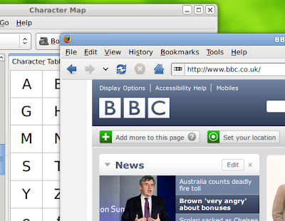
You’ll notice that while the text has slightly less contrast, it actually preserves the form of the letter shapes much more faithfully, just like Mac OS X. As long as you don't have a low resolution monitor (less than 96 dpi), the characters will appear to be just like printed type, and you’ll forget you’re looking at a grid of pixels!
Enjoy!
3 comments:
Do you recommend this for Hardy 8.04? Will it improve fonts for mid-2008 version of Ubuntu?
Yes, this works for 8.04.
Jaunty and Karmic (and I'm guessing future releases too) might not need this anymore. Debian (squeeze) hasn't made the switch yet, so, after those dpkg-reconfigure steps with fontconfig-config, you'll also need to enable anti-aliasing (in System Settings on KDE4 desktop) with the "Slight" hinting option. Enjoy!
Post a Comment